Art Journal Challenge: No Pencils Allowed!

I decided to start a new art journal with one simple rule – no pencils and no erasing allowed.

I love to do pen and ink work with watercolor.  Yet time and again I won’t start something in my art journal because I fear that it won’t turn out good enough.  I am trying to increase my spontaneity because I do believe that the whimsical style that I want to create cannot be found in perfection.

I thought it would be fun to share with you the tools that I will be using to create all the images in my new art journal.

Most important is a waterproof black fine line pen and a journal in a size you like with paper that can hold up to some light washes if you want to add color.

Here is my pen & journal:

Art journal & pen - TabascoCatArt.com

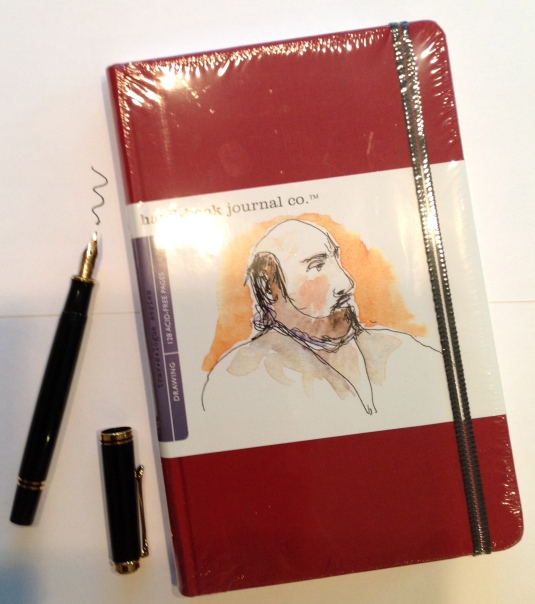
I use a Pelikan pen with a modified flex nib that I got from Richards Pens. If you are interested in fountain pens for general writing or for sketching Richard is extremely knowledgeable and very helpful.  I am a fountain pen junkie and that’s why I went for this option.  The best waterproof ink for fountain pens (that won’t clog them) is called Platinum Carbon Black.  It is an amazing ink because it dries really fast and is very water resistant right away (some inks you have to wait a few hours for them really to be resistant).  You could also use fine point Micron or Pitt pens.  I have used these and they work great too.

The journal I am using is a Handbook Artist Journal.  I like this journal because the paper is a little heavier, has just a bit of tooth, and is off white.  I don’t particularly like Moleskine Journals because the paper is too yellow for me and there is no tooth at all – this is just a personal preference.

You can use lots of media to add color – watercolor, watercolor pencils, inks, or markers.

Here is what I use:

Inktense and brush - TabascoCatArt.com

I use my Inktense water soluble ink pencils from Derwent with a water brush.  I talk about the Inktense pencils in detail here.  I use the set of 24 colors because I get a bit bored with the set of 12.  I like to use a water brush instead of a regular brush because it is more portable (water already included!) and it works extremely well for lifting the color from the pencil and then applying it with the brush to the journal page.

As you can see I also created a little palette card that fits right inside the box of the pencils.  You can’t tell the color by looking at the pencil tip and the color on the pencil end is not accurate either so I find having the palette card very helpful.

So here is a page from my new journal where I did just that – sketched an everyday object in pen & ink, added some color using Inktense and…Viola!  Whimsy in the making!

harrods tea - TabascoCatArt.com

Hope you enjoyed the post.  I am off to have a hot cuppa and some cookies!!


More Art Journal Fonts

For some reason when I am creating pages in my art journal and want to do some hand lettering I seem to get stuck.  My brain sort of freezes up and I can’t seem to remember any fun fonts to use.

I finally decided to create some art journal font exemplars so that brain freeze would not slow me down during journaling.

I then had to decide where to keep the exemplars – duh moment – in my art journal of course!

Here are some of the fonts I have collected so far:

Art journal fonts 1 - TabascoCatArt.com

And here are some more:

Art journal fonts 2 - TabascoCatArt.com

I have decided that any time I run across a nifty font I will add it to my journal so that I always have my exemplars with me!

If you are into fonts – here are some other fonts I shared awhile ago.


Illustration: Asparagus

Asparagus lettering - TabascoCatArt.com Last post I promised to share with you where I used my new hand carved asparagus stamp.

This was part of an exercise from Jane LaFazio’s on-line class that I talked about here.

We were to paint a vegetable of our choice, make a hand carved stamp or two and incorporate it all together into one design.

Here is my design – with my painted asparagus, asparagus stamp and hand lettering (I just love to add lettering to things!)

Asparagus background - TabascoCatArt.com

When I created this I honestly had no idea what I was going to put into the middle of it.  Having had asparagus on my mind for a couple of day, I started to get hungry for my favorite asparagus dish – Oven Roasted Asparagus.

Ah ha moment!  Why not add the recipe to the middle of this design?  So that’s what I did (and got to practice some more hand lettering to boot!).

Asparagus illustration - TabascoCatArt.com

You’ll notice that I added a couple of extra details including the original label from the asparagus package which I distressed using alcohol inks.  These inks are a lot of fun because they work on practically any surface (except plain ‘ol paper!).

If you look closely you will notice that a couple of the stamps have been added as a collage layer.  That’s called a mistake that turned into a “happy accident”.  A couple of the stamped images turned out pretty poorly and at one point I was about ready to scrap the entire piece.  After all the work I had invested in it I decided to try to salvage it instead.  So I cut out some stamped images and glued them over the crappy ones.  It worked out great!  Now there was even more dimension in my mixed media piece!

I was thinking that if I created 11 more seasonal veggie designs to go with this one, I could make it into a cute (and tasty) wall calendar.  What do you think?